The Influence of Paint Colours on Home Interiors
After years of living in rental properties with neutral, beige walls, the creative freedom that comes with owning a home is unmatched. Many homeowners are eager to express their personality through bold and vibrant paint choices. However, according to interiors expert Jordana Ashkenazi, this enthusiasm can sometimes lead to regret if not approached thoughtfully.
Jordana has warned that simply selecting a colour you love may not be the best approach. She explains that while people often believe certain colours will enhance their mood or energy levels, the reality can be quite different when surrounded by that shade daily. “Just because you love a colour doesn’t mean you need to live inside it,” she says.
New research from Wickes has revealed regional preferences for paint colours across the UK. For instance, Londoners tend to opt for white, while the south west of England prefers orange, and Wales is known for its yellow walls. Understanding these trends can help homeowners make informed decisions about their own spaces.
White: A Timeless Choice
White remains the most popular choice in London, with over 70% of homes choosing it as their go-to colour. According to Jordana, this is not surprising given the desire to maximise light and create a sense of space in compact homes. However, she cautions against assuming that all dark rooms should be painted white. “White can be timeless, but brilliant gloss white can sometimes feel more like a dental surgery than a dream home.”
For those who prefer white, Jordana suggests carefully selecting the shade and tone to avoid a clinical look. Soft off-whites, chalky whites, and warm ivories are her recommendations. She also advises considering the character of the property rather than fighting against it.
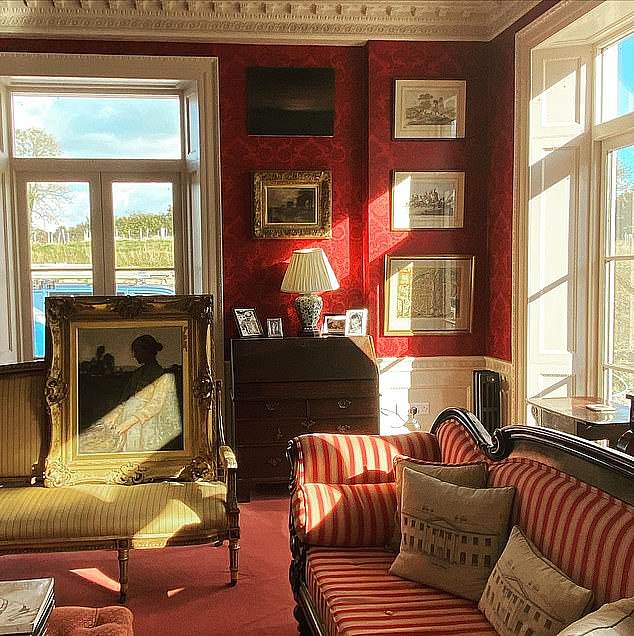
Red: A Bold Statement
Red is a popular choice in Scotland, but Jordana warns against using it on living room or bedroom walls. While red can create warmth and comfort, she believes it’s better used as an accent through artwork, cushions, or accessories. “Bright reds in particular can quickly veer into fast-food restaurant territory,” she says. “For me, red is a supporting character, not the main event.”
Purple: A Challenging Choice
Purple is most frequently purchased in the south east and east of England. However, Jordana notes that too much purple can make a home feel more like a theatrical dressing room than a luxury townhouse. “Purple is probably the most challenging colour on this list for me personally,” she admits. “Bright purple walls are a definite no from me.” If used at all, she recommends soft lilac tones in nurseries or children’s bedrooms.
Beige: A Versatile Neutral
Beige has gained popularity, particularly in the north east of England. Jordana believes that while beige is often criticized as boring, it is the texture that makes the difference. “Layered properly with timber, stone, linens and boucle fabrics, beige can look timeless, elegant and incredibly sophisticated.” She also highlights that beige provides a great backdrop for introducing other colours through decor.
Cream: A Safe and Stylish Option
Cream is the preferred choice in the West Midlands. Jordana describes it as the interiors’ equivalent of a little black dress—versatile and never going out of style. “It works almost everywhere and never really goes out of style,” she adds. Cream offers flexibility, allowing homeowners to introduce colour through furnishings and accessories without repainting.
Yellow: A Cheerful Choice
Yellow is popular in Wales, with many hoping it will bring a sense of cheeriness to their homes. However, Jordana advises caution. “Bright yellow often ends up feeling more highlighter pen than happy home.” Softer buttery yellows can work well in traditional homes, but in modern spaces, they may feel dated.
Orange: A Unique Choice
Orange is the most frequently purchased paint colour in the south west of England, though only 0.40% of the region chose it. Jordana warns that once committed to orange walls, finding compatible furniture and finishes can be challenging. “Orange belongs in a terracotta pot rather than across four walls,” she says. Soft terracotta or Tuscan-inspired tones can work beautifully in the right setting.
Brown: A Sophisticated Choice
Brown is popular in the north west, Yorkshire & Humber, and East Midlands. While it offers a sophisticated look, Jordana cautions that the shade matters. “There’s a huge difference between sophisticated mushroom tones and looking like you’ve accidentally painted your house the colour of gravy.” She recommends using brown in softer mousse, taupe, or mushroom tones for studies or bathrooms, and introducing it through furniture and accessories in living spaces.