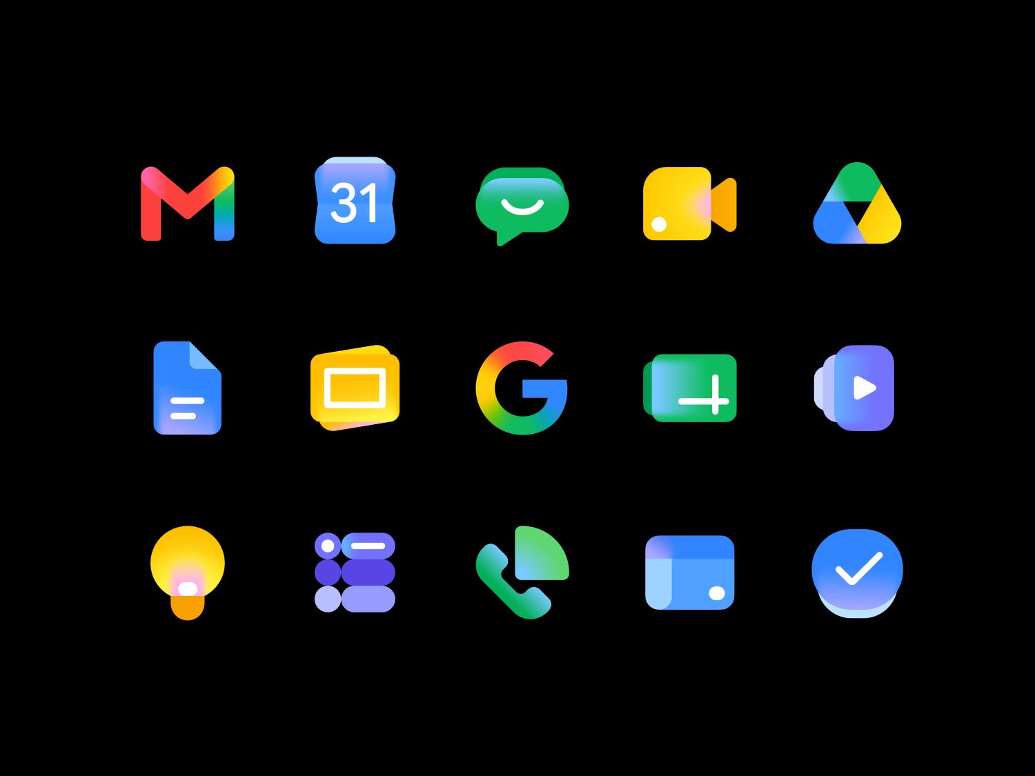
Google’s New App Icons Spark a Wave of Creativity and Humor
Google has recently revamped the icons for its popular apps, including Gmail and others, leading to a surge of memes and creative interpretations from users across the internet. The redesign has sparked a lighthearted conversation, with many users taking the opportunity to joke about the new visuals in a humorous way.
One of the most notable reactions came from an X user who used a pair of shorts to represent YouTube Shorts. This clever take on the app icon caught the attention of Sundar Pichai, the CEO of Alphabet, Google’s parent company. Pichai responded with two thinking emojis, showing his interest in the idea.
A Trend That’s Taking Off
The trend of users submitting their own designs for Google’s new app icons has grown rapidly. Some of the most popular ideas have included using Doc Martens to represent Google Docs, bed sheets for Sheets, and sandals for Slides. These suggestions highlight how everyday objects can be creatively reimagined as digital icons.
One user, Trung Phan, proposed that Google could be tapping into a massive opportunity in clothing and home textiles. He captioned an image featuring shorts, sandals, and bed sheets with the message: “Google is sitting on a massive clothing and home textiles opportunity.” This idea led to further iterations, such as a leather racing jacket for Google Drive, which many found amusing.
Memes and Creative Interpretations
The redesign has also inspired a wave of memes on platforms like X. Users have taken a more literal approach, suggesting that Google could draw inspiration from everyday life when creating its new designs. One user wrote, “Google could be doing so much more,” highlighting the potential for more imaginative and meaningful iconography.
While some of the suggestions are clearly meant in jest, they reflect a broader trend of users engaging with technology in a more personal and creative way. This interaction between users and tech companies is becoming increasingly common, as people look for ways to express their individuality through digital tools.
Google’s Broader Vision
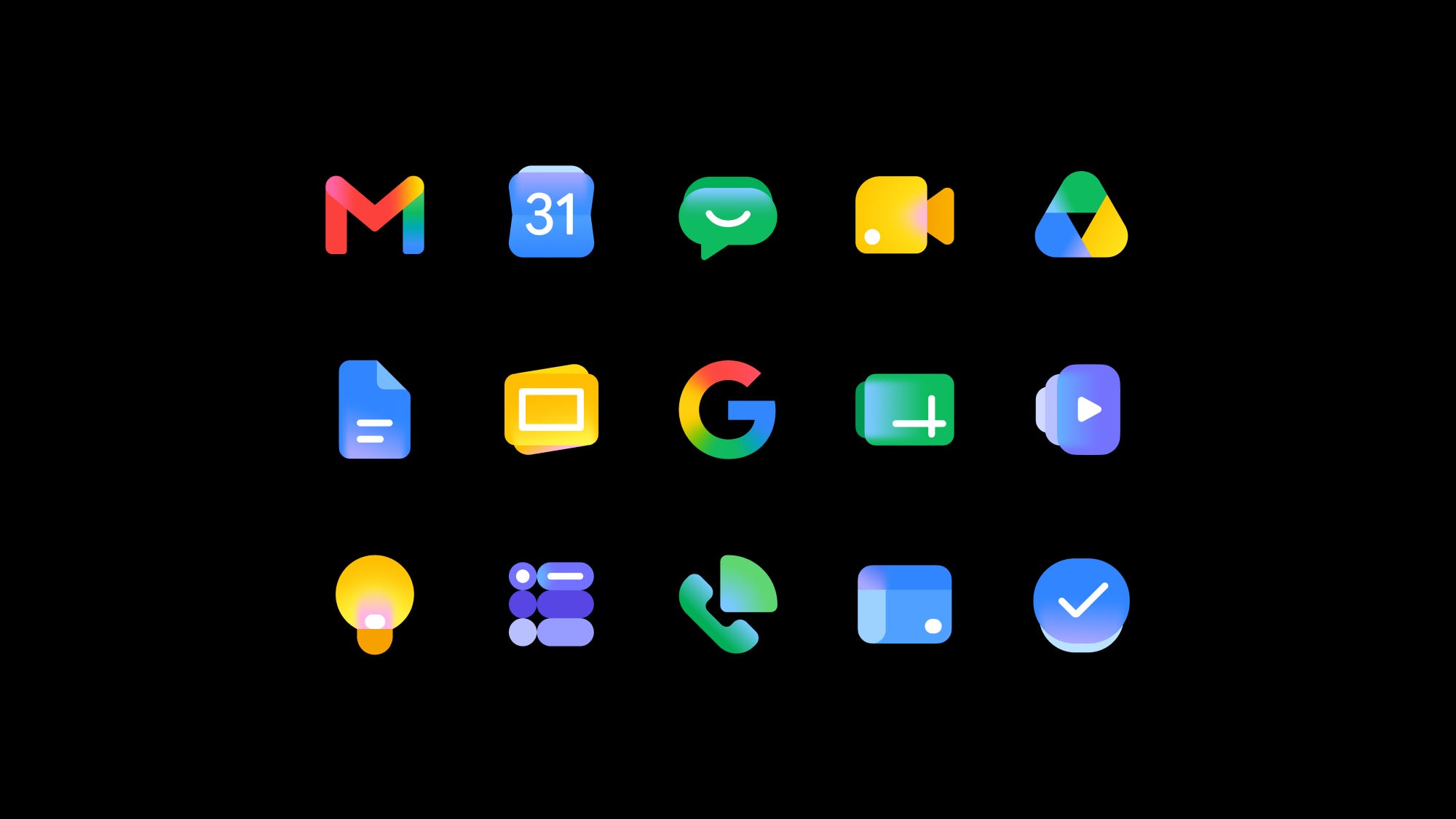
Google’s decision to revamp its app icons was aimed at creating a more consistent and cohesive visual experience across the Google Workspace. This includes apps like Gmail, Docs, Sheets, and Slides. The company emphasized that the new design would make the icons more distinctive and easier to recognize.
However, the reaction from users has shown that even small changes can have a significant impact. In 2022, Cracker Barrel faced backlash when it tried to modernize its logo, which did not resonate well with customers. Unlike the playful discussions around Google’s redesign, the response to Cracker Barrel’s change was far less favorable.
Expanding Beyond Software
While the current focus is on app icons, Google has been exploring other areas of innovation. The company previously experimented with smart glasses and plans to launch AI-powered glasses later this year in collaboration with eyewear brands like Gentle Monster and Warby Parker. These products could potentially compete with Meta’s Ray-Bans, showcasing Google’s growing presence in the wearable technology space.
The Power of User Engagement
The new Google designs have not only made icons more distinctive but have also encouraged users to engage with them in new ways. The memes and creative interpretations surrounding the redesign have ensured that the changes are not going unnoticed. This level of user interaction highlights the importance of involving the community in the design process, even if it’s done in a humorous manner.
As the conversation continues, it remains to be seen how Google will respond to the feedback from users. Whether the company will incorporate any of the suggestions into future updates or stick to its original vision is yet to be determined. For now, the redesigned icons have become a source of entertainment and creativity for many.