
Introduction
The World Cup is underway, and with it comes the spectacle of international football shirts that have captured the attention of fans and critics alike. This summer, 48 nations are competing in the men’s tournament, leading to a diverse array of kits that range from visually stunning to outright baffling. From the bold patterns to the subtle details, each shirt tells a story of its nation’s identity and design philosophy.
Worst Kits: A Closer Look
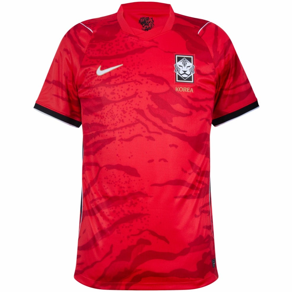
96. South Korea home
Starting at the bottom of our rankings, South Korea’s home kit features a camo print that leaves much to be desired. The pattern is confusing, with elements that could be interpreted as hills, volcanoes, or clouds. Nike explains that it represents an ambush of tigers, but we’re still not convinced.
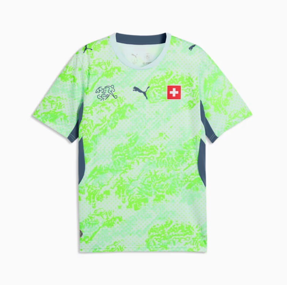
95. Switzerland away
Switzerland’s away kit is a chaotic mix of colors and designs, resembling something a toddler might create with a highlighter pen. While the crest is a positive feature, the overall design is unappealing.
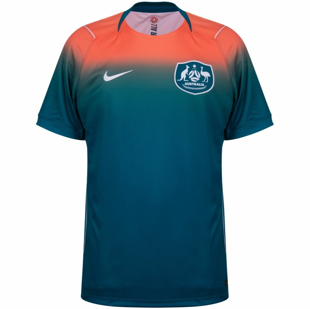
94. Australia away
Australia’s away kit is a bold fade from pink to green, which we don’t find appealing. The color transition is jarring and doesn’t complement the team’s identity.
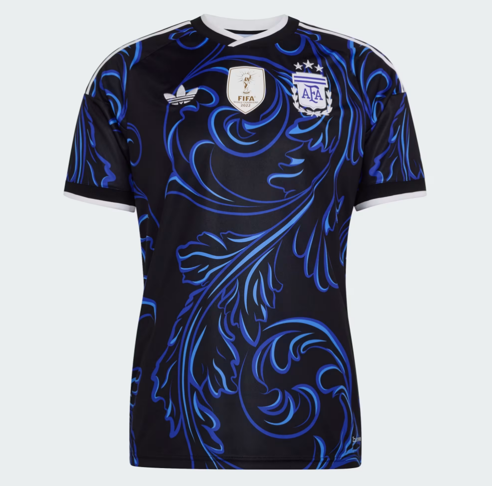
93. Argentina away
Argentina’s away kit is garish and unflattering. The design lacks subtlety and fails to capture the essence of the team.
92. Paraguay home
Paraguay’s home kit is reminiscent of a child’s crayon drawing. After much deliberation, we’ve decided it belongs in the “nursery artwork” category, which is not a compliment.
Middle of the Pack: Mixed Reactions
85. Uruguay away
This kit is actually a USA shirt, and we won’t be taking any questions on the matter. It’s a clear misstep in the rankings.
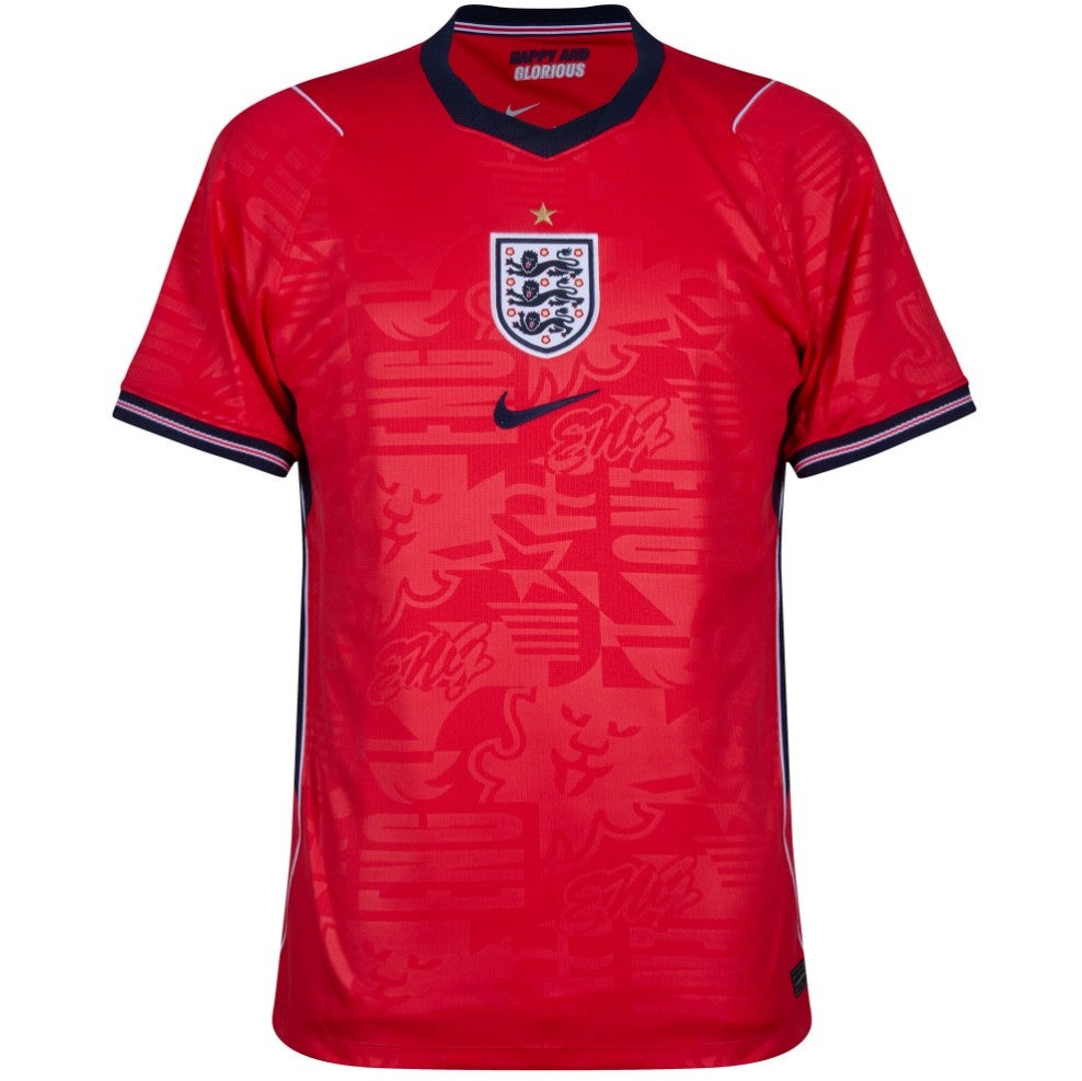
84. England away
England’s away kit has a central crest that gives it a Pro-Evo feel, which is not a good thing. The background is also somewhat strange.
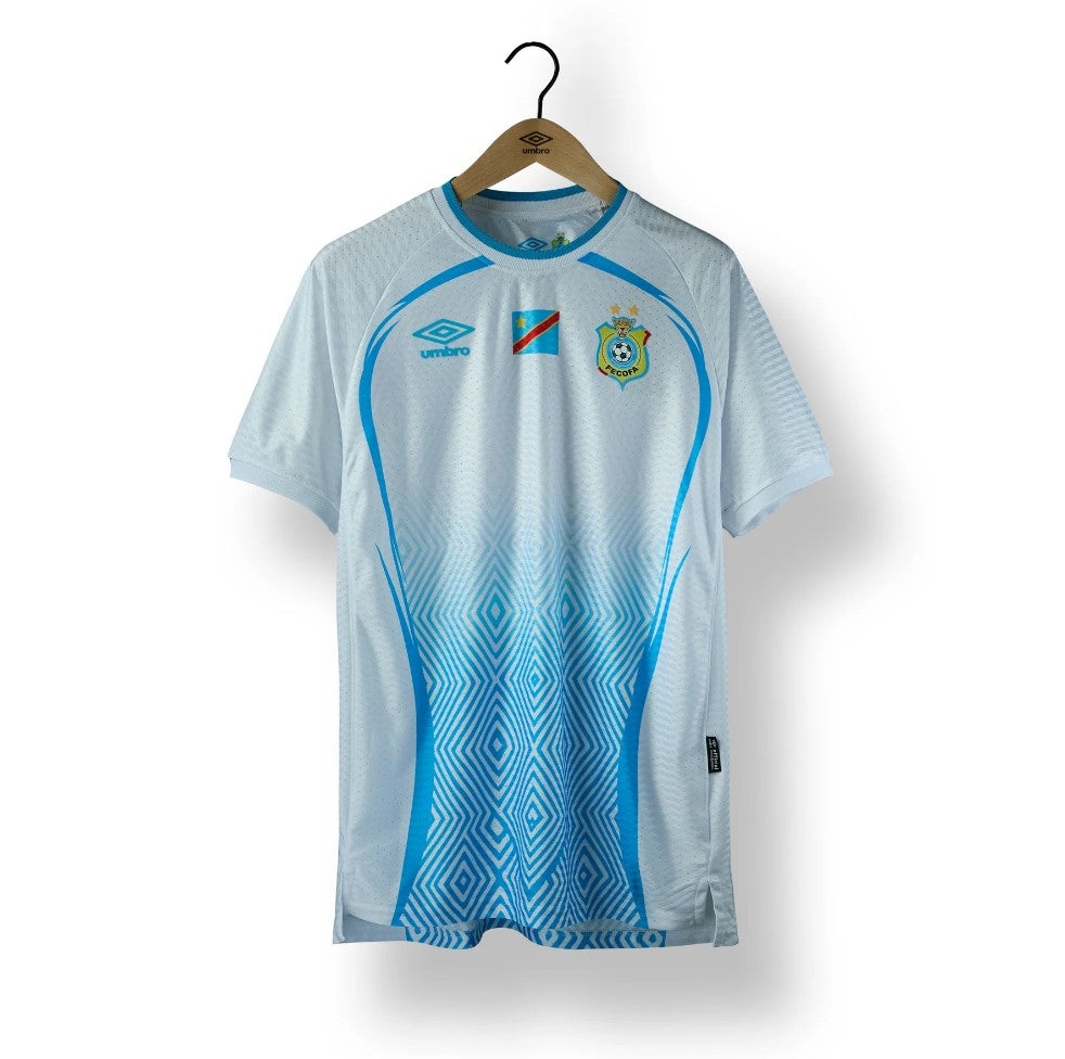
83. DR Congo away
The color fade on DR Congo’s away kit is not effective. It looks more like San Marino than DR Congo, and the lack of contrast is a major issue.
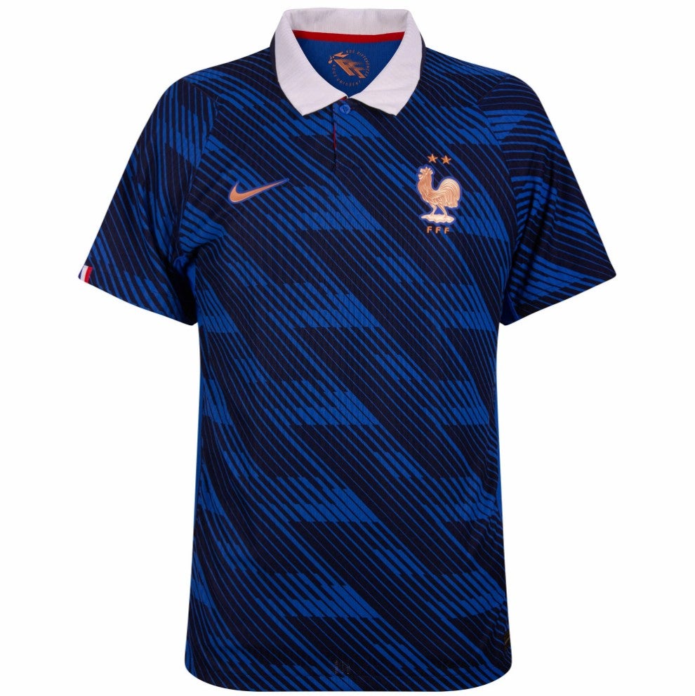
82. France home
France’s home kit features a lighter blue and a zig-zag background that feels excessive. The design doesn’t quite hit the mark.
Top Kits: A Celebration of Design
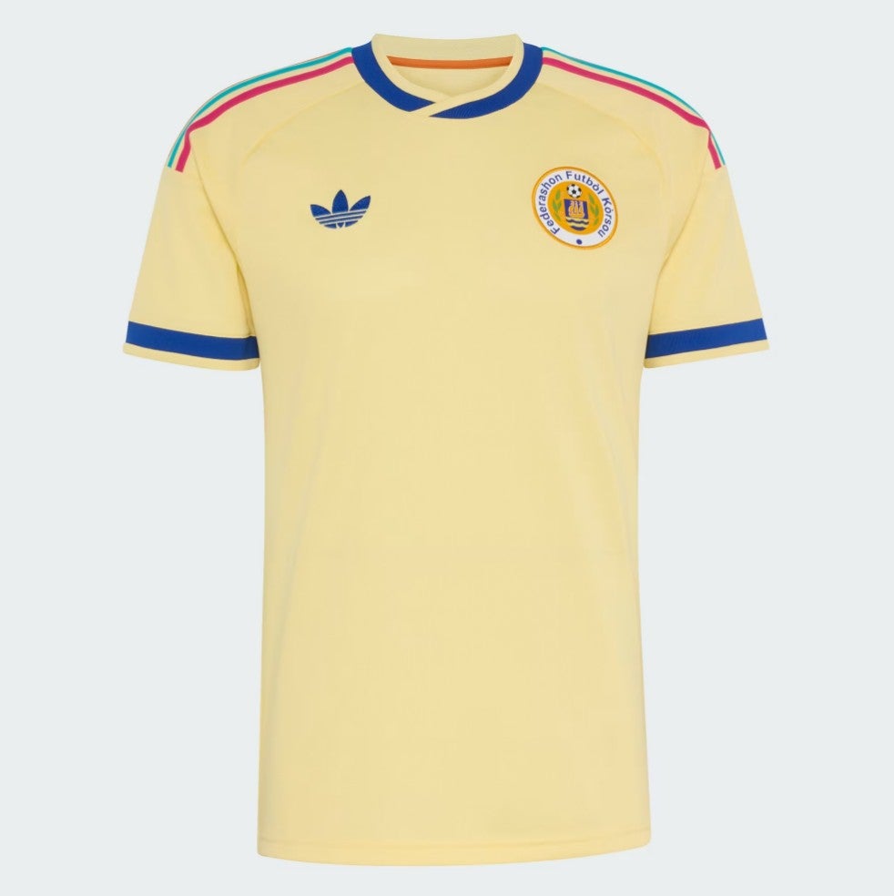
1. Curacao away
Curacao’s away kit is the standout of the tournament. The soft yellow tone, bold blue sleeves, and old-school Adidas logo make it a perfect blend of style and nostalgia. The bright colors and unique design make it a true winner.
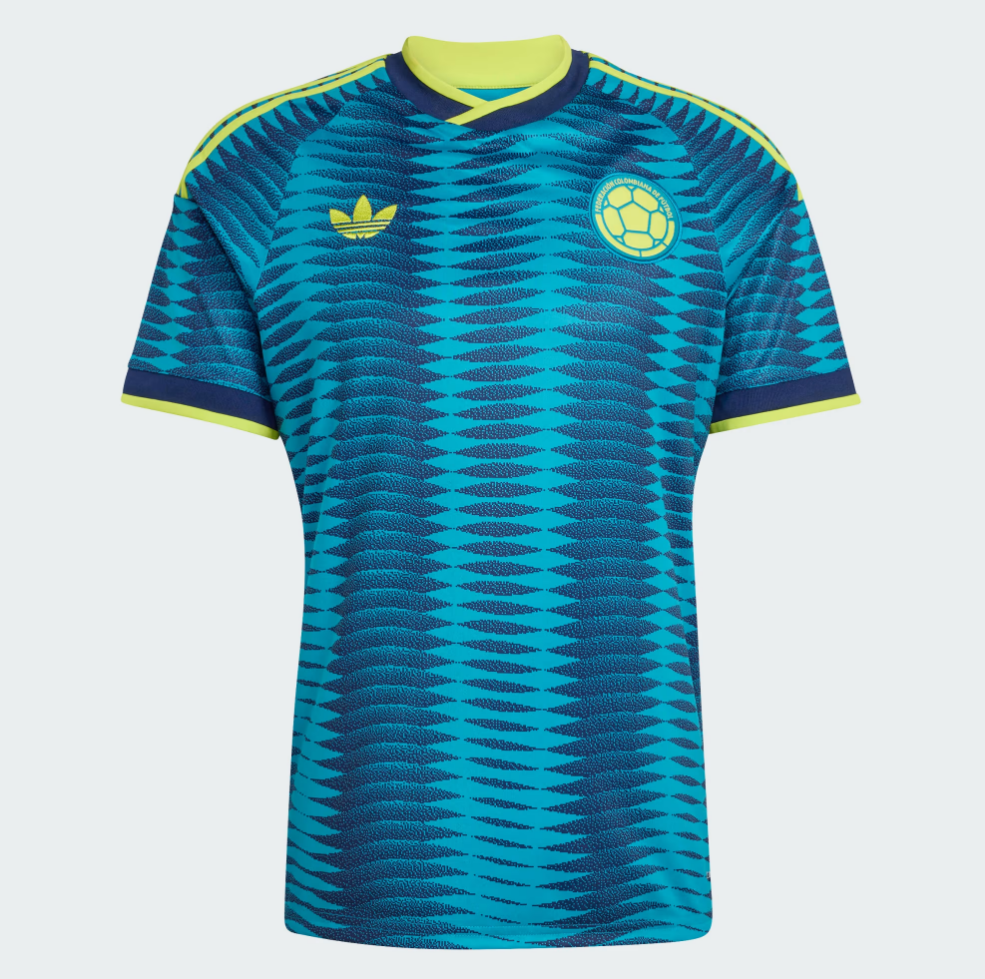
2. Colombia away
Colombia’s away kit captures the essence of the Caribbean coast with its vibrant colors and distinctive pattern. It’s a stylish choice that reflects the team’s cultural roots.
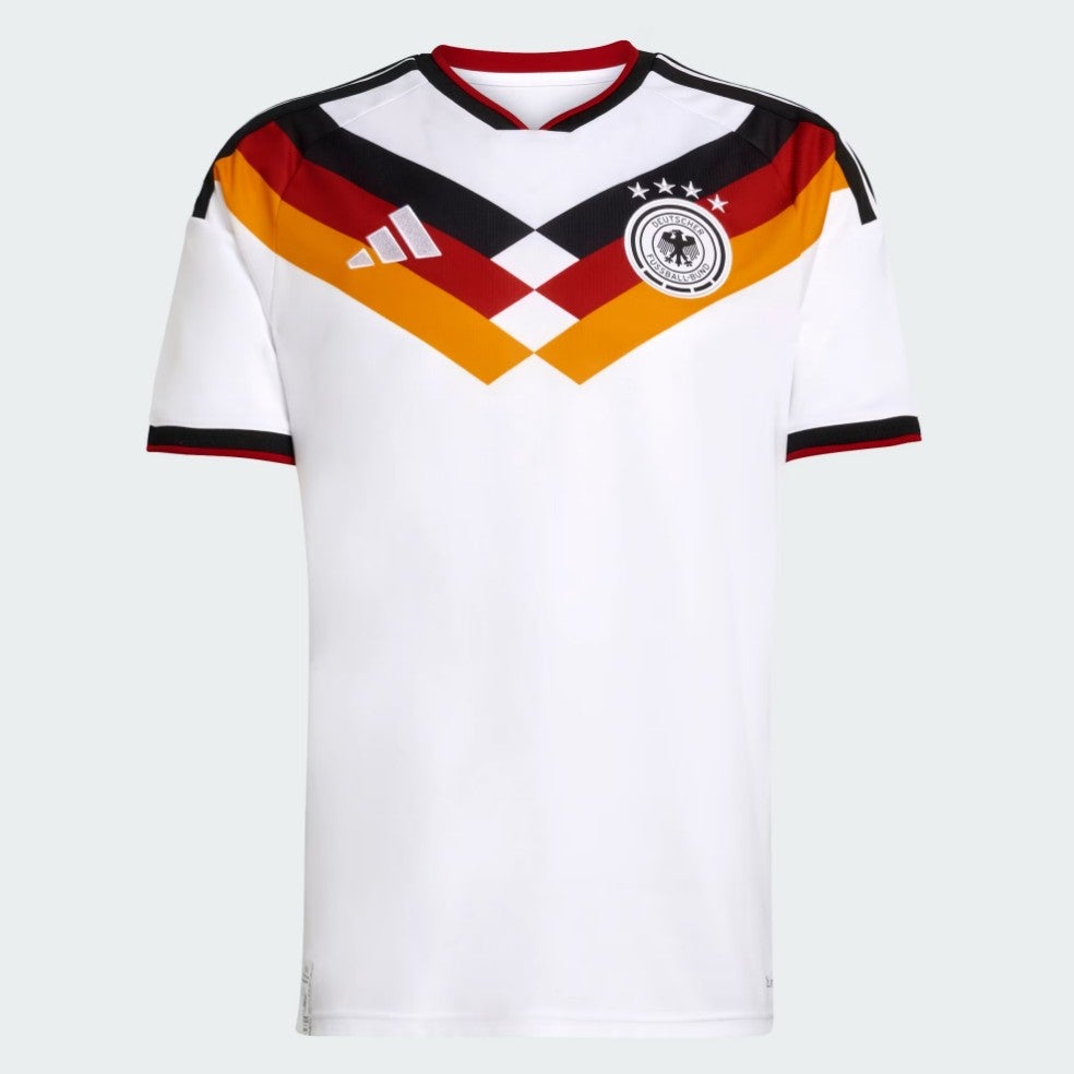
3. Germany home
Germany’s home kit is a nostalgic throwback, evoking memories of the Italia 90 and USA 94 tournaments. It’s a well-designed shirt that stands on its own while paying homage to the past.
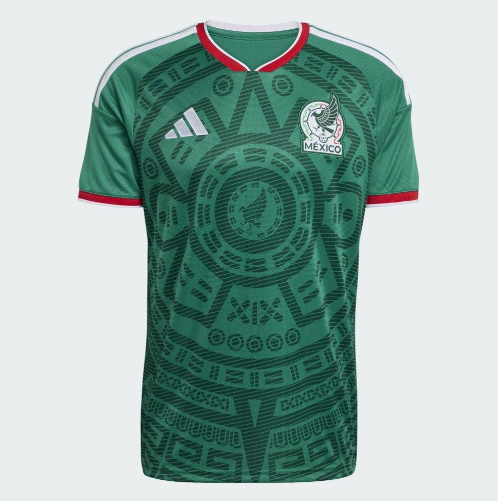
4. Mexico home
Mexico’s home kit is a modern take on the Aztec theme, featuring a cool design that pays tribute to the nation’s rich heritage. It’s a stylish and meaningful choice.
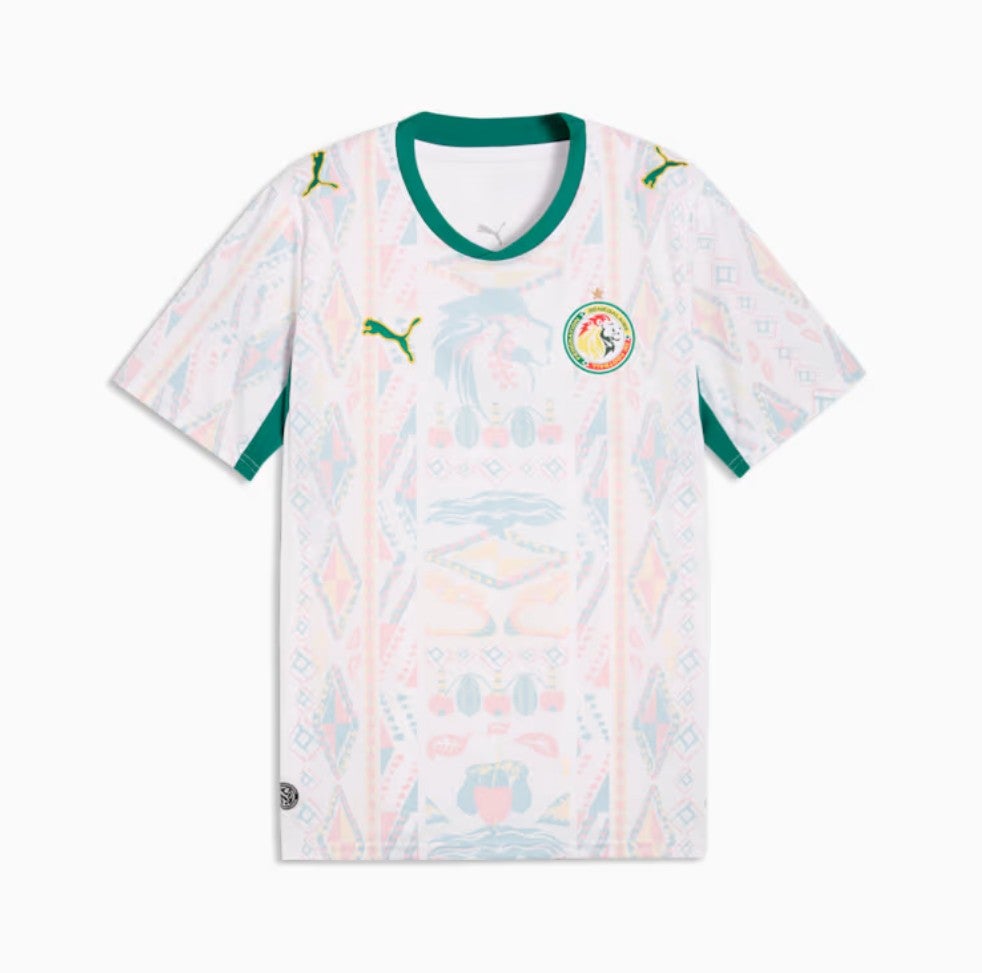
5. Senegal home
Senegal’s home kit is a simple yet elegant design that works well for the team. It’s a great example of understated sophistication.
Conclusion
The World Cup 2026 has brought forth a wide array of football kits, each with its own unique story and design. From the worst to the best, these shirts reflect the creativity and cultural identity of the participating nations. Whether you love them or hate them, there’s no denying that they add to the excitement of the tournament. As the competition continues, we can only hope that the next set of kits will bring even more innovation and inspiration.